Monday, July 30, 2012

Bauhaus Art as life

Farkus Molnar, Desing for a single-family house (1922). Barbican. Photo via Bauhaus-Archiv.

At a time when every other major London museum and gallery is presenting something unashamedly British, the Barbican Centre ensembles the biggest Bauhaus exhibition in the UK for over 40 years.
Bringing together more than 400 works, most of which I had only seen in books, real treasures to look at: not just paintings, but prints and photographs, ceramics, sculptures, textiles, furniture,  invitations, costumes, puppets, posters and many other things by Bauhaus masters such as Annie and Josef Albers, Walter Gropius, Johannes Itten, Wassily Kandinsky, Paul Klee, Mies van der Rohe, László Moholy-Nagy, Oscar Schlemmer and Gunta Stölzl.

A film titled, ‘How do we live in a healthy and economic way?’ features the conveniences of the new domestic design, such as bendable lamps and transformative furniture. Interior decoration, furniture, and fixtures to complement the architecture. 

A piece that captured my atention was Moholy-Nagy’s Construction in Enamel 1, 1923, (one of three works Moholy-Nagy actually commissioned from an enamel sign factory dictating the composition over the telephone) I really liked the beautiful and imperfect effect of the enamel finish.

The exhibition celebrates the life and spirit of the Bauhaus – one that is characterised by experimentation, collaboration and play. The willingness to see things in a totally new way, going ahead with a tremendous sense of adventure.

Josef-Albers-Bauhaus-Lettering-Set-1926-Barbican.png

Typographic innovations, such as the use of all small letters, that characterize the shift from early eclecticism to a new style privileging clarity and efficiency of communication. I particularly loved Joseph Albers' letter design, cuts of milk glass mounted on a bright yellow background.

Party invitations, photographs of events and festivities, even gifts shared between students and colleagues are showcased to demonstrate the lively social life. Photographs of costumes for the Metal Party, where students dressed out in costumes made with frying pans, spoons and pots, and wrapped themselves in aluminum foil, highlight the whimsical creative outlet that these parties meant and shows how much fun they must have had at the Bauhaus.
Add caption


Rooms full of color theory exercises from Paul Klee and Kandinsky’s preliminary courses and texture studies with folded paper and manipulated mesh wires from Alber's classes give insight onto the student’s training and work.
All the elements are there: the geometric shapes, the love of the grid, the playful but purposeful use of color, the experimentation.
 
I bought the catalogue, mostly for the texts since no photograph in a book could ever capture the subtle colors and changes of texture within the weavings or the shiny texture of the enamel. I feel very lucky to have seen all of this amazing work together under one roof. One leaves the exhibition feeling invigorated and inspired.

Barbican Art Gallery
Until August 12
Silk Street London
EC2Y 8DS


Sunday, July 22, 2012

Labour and Wait


I felt like a child in a candy store the minute I went inside Labour and Wait. glass Jars, pure linen dishtowels, beautiful enamel bowls, pots and mugs. Every classic household item you can think of.

Brooms, buckets and dusters, many of which one could find in Mexico City's markets and street stalls, somehow presented as design pieces, carefully selected to be part of a well curated collection of timeless objects.
Labour and Wait was intended as a place to buy functional, well designed, high quality products, at a time when most retailers were tending towards cheap, disposable low quality items. I couldn't agree more with this philosophy.

After quite a few hours well spent, I left the store with a beautiful vintage linen tablecloth, a classic falcon milk pot for my enamel collection, two classic french striped Armor lux breton shirts for the kids and an addition to my list of impossible-to-travel-with items that I wish I could have bought: a gorgeous enamel sink that would have been perfect for our Kitchen in Valle de Bravo.

Let us, then, be up and doing,
With a heart for any fate;
Still achieving, still pursuing,
Learn to labour and to wait.
 
A Psalm Of Life 
by Henry Wadsworth Longfellow


Labour and Wait
85 Redchurch Street  London,
Greater London E2 7DJ 


Friday, July 20, 2012

London Albion Café


London has been a trend topic for a while now, ever since the Royal Wedding actually. Then it was the Queen's Jubilee and now, well, The Olympics. Just a few hours before the torch arrives to the capital it feels as if I'm already late. Anyhow, I will be posting a little guide of London that I have put together after my visit this past June.

My first review will be for Albion Café, an eatery serving typical British fare made with straightforward hearty ingredients  housed in a converted Victorian warehouse in the cool neighborhood of Shoreditch and created by no other than Sir Terence Conran.

Brick and white walls, refectory style cream tiles, rows of red Tolix chairs, factory lights, and large windows which let plenty of natural light into the place, Golden Syrup tins on the table holding napkins and cutlery with a no-nonsense vibe that feels as if you are hanging out in a mate's country kitchen (the exact vibe I wish my country house in Valle de Bravo will ever have).

I am no expert on British food, but the sausage and mash I had was delicious and had a sweet comforting familiar taste that reminded me of my father's onion soup.

At the front there is a shop as much old school farm shop as trendy organic deli, with wooden boxes full of vegetables that look straight out of the ground and stacks of glossy jam jars. Enamel pots and mugs which of course I could not resist buying, caramel candy packed in beautiful antique looking cans, strong mustard, cotton dish towels...

Loooved the place. Can you tell?


All pictures by neenalife blog
Albion Café Bakery and Food Store
2-4 Boundary Street,
Shoreditch,
London E2 7DD
020 7729 1051

Friday, May 11, 2012

Handpainted Chinoiserie Wallpapers

Via House Beautiful

I came across this picture on House Beautiful magazine featuring an exquisite hand painted wallcovering, while searching for inspiration for a new project.
Doing some research, I found out about De Gournay,  a brand that specializes in reproductions of historic prints, particularly 18th century Chinoiserie and 19th century French designs.
Even if you don't know the name, chances are you'll have at some point seen De Gournay's fabulous wallpapers. Most probably a spread on a fabulous interior design magazine or in some glossy fashion shoot or perhaps on the cover of 'Domino, the book of decorating'.
Their wallpapers are a true luxury, hand painted by artisans, most of them are customized to clients' specifications. An impressive range of materials is available: silk, India tea paper or Xuan rice paper, to name just a few. The wallpaper is first treated with traditional pork bone glue, as it was some 300 years ago, before spending around five weeks dyeing or gilding with shimmering 22carat gold leaf, depending on clients' choice.
I am specially fond of the monochromatic custom made color schemes. I am sure you'll agree the results are nothing short of spectacular.


Elle decor via stylecourt
via barbarajacksier

8/h4>

Via design sponge


Thursday, January 12, 2012

Tuesday, April 19, 2011

Decorate Book Launch at Liberty

Liberty

The U.S. edition

Holly Becker's book Decorate was launched a few days ago at Liberty's in London . It looks like it was the bloggosphere event of the year, actually I don't know of any event up to date bringing together as many personalities of the world of blogs and design from all over the world.
Everyone was there: Yvonne Eijkenduijn from Yvestown, Stylist Selina Lake, photographer Debi Treloar, Emily Chalmers from Caravan (super nice store in London) and author herself of the book Flea Market Style.

In case there’s anyone out there who doesn’t know who Holly is (where have you been?!), she is the author of Decor8, a blog dedicated to sharing fresh decorating ideas, beautiful interior spaces, independent art and design that inspires over 35,000 readers daily.

The book (with nearly 300 pages) is packed with ideas and inspiration from creatives worldwide and gorgeous photography by Debi Treloar. Stylish houses and quotes from guru designers such as Jonathan Adler, Amy Butler, Rita Konig (ex editor of Domino Magazine) and Anita Kaushal author of my favorite book The Family at Home.
A directory in the back guides you through the best of interiors accessories, art, design, furniture, and a must-read list pointing out some of Holly's favorite blogs.

The event was hosted at Liberty’s new kitchen and dining department, what a lovely place to have your book launched!
Holly and Leslie (from a creative mint ) styled a dining table for the event, the center piece is an old lampshade with a disco ball, fabric scraps and old keys. Natural flowers were displayed in glass bottles, old jelly jars and ceramic vessels that look like tin cans. They also used old books and vintage cake stands. Notice the tablecloth was made with Mitzi Liberty Tana Law fabric (the same I use for the banner of my blog).

If, like me, you are wishing you had been there, you can get an idea of what the event was like on this video.

Wednesday, December 15, 2010

The Pale Blue Door


I just found the most amazing setting, I was so mesmerized that I had to write about it immediately, even if this means I will be late to my morning appointment with the doorknobs lady.

It's The Pale Blue Door, a nomad restaurant designed by Tony Hornecker, a set designer who has worked with the likes of Kylie Minogue, Stella McCartney, Puma and Vogue. The particular dinning spot opened in London in 2009 with the support of his family (his mom supplied the tablecloths) and friends, to 24 open-minded diners who traveled across London to experience Hornecker’s concept. In 2010 the restaurant traveled to Buenos Aires, Santiago, New York and Berlin.

It is a homemade structure that resembles an overgrown dollhouse, an art installation of balconies and secret rooms, built and furnished with the trash and castoffs that Hornecker himself collected around town for his fantastical creation.

The wonderful surreal ambiance resembles sets from the Mad Hatter's tea party. Vintage tablecloths, colorful antique painted furniture, old chairs, wooden stairs. Flower curtains that hide cozy spots with cushions to lay on amazing lighting.

I can't believe my eyes when I look at the wonderful photographs of Manuel Vazquez. I just wish The Pale Blue Door comes to Mexico next year.

Saturday, September 25, 2010

Shops in Norway

This summer I spent ten days in Norway and 10 days in Paris, it was a wonderful vacation and I got to do one of the things I like the most: visiting shops. Not so much shopping, but just visiting, kind of like when one visits a museum. Looking around, getting inspired, amazed with styled vignetes, beautiful arrangements of everyday things placed on the perfect spot. Gray was the color that was mostly used, along with rich textures: old wood, linen fabric, stones, oxidized metals and of course liberty fabric. The natural world is brought inside and paired with industrial pieces. Sheepskins and antlers are the Scandinavian staple this season, and the It piece of furniture was the Tolix Chaise A chair, designed in France in 1934 and made from galvanized steel, it was for sale in almost every shop I went to.


Bolina, Oslo


Shabby, Oslo

landromantikk, Tønsberg


Thursday, June 24, 2010

Hip and Soul in Paris

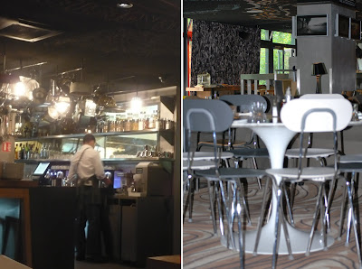
This was my favorite part with the kitchen tools hung on the bar and the picture of the granny on the sofa. Loved the vintage chairs painted in white and check out the legs left unpainted.


Mexican Oilcloth tablecover on the comunal table and wooden pizza oven in the back.

Last weekend we stayed at the oh so chic Mama Shelter hotel in Paris. A perfect mix of hip and soul, The Sun Herald called it.

Far away from ultra modern sterile interiors, Mama shelter is cozy and fun. One of the latest creations of Philippe Starck, who also designed one of my favorite places in Miami, the Delano hotel in South Beach.

The theme is quirky design chic, filled to the brim (actually, a vast chalkboard ceiling covered in graffiti) with Starck’s inventiveness, a mix of classic design pieces like the tulip table, light fixtures made from bird cages and bizarre Asterix and Obelix face masks used as lampshades are all part of the fun. The rooms are small but functional. The beds, are hugely comfortable with crisp cotton sheets and each room has got a Mac screen that works as your TV, Radio, and includes Internet access.

The restaurant is overseen by one of France's leading culinary figures, chef Alain Senderens, There’s a huge communal table with a long oilcloth table cover, in cherry print. I actually checked and it was made in Mexico, from the same brand I use for Neena products.
It's also got a beautifully furnished rooftop terrace and bar where barbecues are the rage.

The hotel is located in Saint Blaise neighborhood, the city's boho SoPig (south of Pigalle) in the 20th arrondisment. This neighborhood hosts a few of the latest bars and rock venues and its supposed to become Paris equivalent to New York's Meatpacking district, although I found it to be more of a residential area with families walking by and a nice apartment buildings and a school a few blocks away from the hotel.

I loved every bit, each piece was thoughtfully selected and placed, the colors, the pictures, the fabrics, the textures. A lot of messages are sent through images (they had interesting paparazzi photos of the British royal family hung on the wall at the dining room) and through graffiti on the walls and on the carpets. I think we will see more and more of this kind of interiors where all these details make the space feel very personal, very well lived.

Tulip table and open kitchen

Mama Shelter Terrace